...Is brought to you by Damien Rice. If you guys have checked out any of the prior tunes, you will realize this guy is totally different from everything presented so far. He is in the folk genre and can easily impact your emotions/mood. Frankly put, the guy has a gorgeous voice. And I chose this one because the title makes me think of catching up with colleagues over a drink. And isn't that the point of peer dialogues? After reviewing the last peer dialogue session, I plan to keep this one about as simple. There are plenty of comments which could be made for each, but I think I'll limit myself to just a couple of thoughts/points. Also, in spirit of this 'peer dialogue' idea, I think I'll end my posts now with a question posed to my fellow group members. Might be fun to engage, eh? To be fair, Bridget inspired this idea from her post. So I think I'll dive in now, mentioning the various pictures/comments which tickle my fancy. And I believe I started with Bridget first on the prior posting, so guess what Dan? You're up first!
Your found faces posting was definitely entertaining. Loved the 'three eyed monster', and because of that, the child inside of me will forever be terrified of Parmesan cheese bottles now! As if there weren't enough scary creatures trying to get my inner kid already...Heh, but all joking aside, neat concept in the attempt to avoid a traditional face. For my second "thumbs up" to Dan, I looked to his post based on past designers. Specifically, Shiro Kuramata. It seems fitting giving the emphasis spent early on concerning chairs that his designer made a couple contributions of his own. Good call picking someone more modern, thus perhaps easier to relate to. And you provided some fine pictures of his work. I especially liked the dressers, with the extreme curvature. Reminds me of something you would find in a cartoon.
http://dancsp11.blogspot.com/
And of course, who could forget his partner in crime, Bridget? The first thing that jumped out at me was the lack of diverse postings. It is a bit hard to compliment and make conversation over pieces that aren't there! Of course, I tend to stay ahead on these assignments due to my course load, so I'm sure she will have all sorts of things posted after I get this done (I'd bet even by tomorrow, she will have some of the most interesting thoughts uploaded). So, I'll start with her designers as well. I noticed she had an eye out for architects, and frankly, I can't say I blame her. They have some of the most easily recognizable pieces (after all, you can't really hide a skyscraper). I picked 'Asymptote Architecture' for two reasons: the first, the partners started their company the year I was born. Good year, if I say so myself. But more importantly, I liked them due to the example of their handiwork which Bridget provided. That tower in Seoul is stunning. It appears 'futuristic' in the sense that it is sleek, and, well, if a building can be thought of as such, sexy. I feel it is cocky and boastful creation, but to be honest, I feel it has the right to be. And secondly, I just wanted to compliment you on the idea of posting questions for us to reply to within your peer dialogue. Never would have thought of that without reading your last post.
http://bridgetmears.blogspot.com/
With that thought in mind, I have to say my color palate is very open. If I had to chose a favorite color, I might say green? I don't necessarily have one, but I prefer dark hues of colors. If it is towards the white end of the light spectrum, I tend not to the object it is applied to very seriously. Dark blues, greens, and reds are the best with blacks and greys rounding them off.
So now I should think of a question. I will try to keep mine design related to help with grades for these posts. If you had an object in which you were to design, and knowing you could only optimize one of the two key components (form versus functionality), which would you choose and why? I'll always post my answer here as well. I would choose functionality. The short answer? I'm a wanna be engineer. But what I mean is I judge the value of objects by their use. And while I enjoy looking at paintings, or admiring shapes of chairs, I ultimately don't care how it looks. I want my design to work well because it is tangible to measure, as is its resulting value. Where as the form of the object is basically 'art' and is incredibly hard to judge its true value since it is completely subjective to perspective.
Saturday, April 30, 2011
Wednesday, April 27, 2011
"A04:" You Speak My Language
Song title was from Collective Soul. Surprisingly, I don't have a lot of music which relates to letters or language in the title. This was the only one I could easily find, which is disappointing, because the song is mediocre. I wasn't really moved by this one, but the title is the closest fit I have so there it is. Side note, Collective Soul does have very enjoyable music. This particular one just doesn't do it for me. I should begin by saying this was one of my favorite assignments thus far for this class. To prove this, I went a bit out of my way to track down all twenty six letters, not just the twelve required. Once I started, it just seemed really easy to find letters within, well, everything. Apparently, though, not every letter receives equal emphasis (for example, I had trouble finding F and Z, but I could find O in practically everything I looked at). So, a couple of the pictures are harder to see the apparent letter, but I'll be posting them in alphabetical order and providing descriptions when I feel the letter appears more abstract.
A) It was a bike frame tied up to a rack. The frame forms the outer 'A' and the rack makes the cross section. Of course, there are several other bikes that can form the cross on the A, but I saw it as the bike frame with the corresponding, closest rack it was tied up to.


F) This letter took some creativity on my part to see. But if you look at the one fan blade which appears to be perfectly vertical in this picture, and follow it from the tip upwards to where the two metal cords are hanging. There lies the capital 'F'.


A) It was a bike frame tied up to a rack. The frame forms the outer 'A' and the rack makes the cross section. Of course, there are several other bikes that can form the cross on the A, but I saw it as the bike frame with the corresponding, closest rack it was tied up to.

B) This was a latch on a fence in my backyard. It makes a lower case 'b'.

C) This picture was of one half of the two piece plastic shield used on a heavy duty Kitchen Aid mixer I own

D) I flipped a coffee mug upside down and took the picture as is because with the light on it like so, a shadow is cast by the handle back onto the side of the cup. So with the shadow and the handle, I saw the capital 'D'

E) I took a picture of some road lines outside of the Black Well on campus. I distinctly saw the letter 'E', and by cropping of the picture, I think it will be more apparent to others.

F) This letter took some creativity on my part to see. But if you look at the one fan blade which appears to be perfectly vertical in this picture, and follow it from the tip upwards to where the two metal cords are hanging. There lies the capital 'F'.

G) A picture of a roll of scotch tape. Lower case 'g'.

H) A wooden chair from the dinning room table. Makes a capital 'H'.

I) The memory unit port with the wireless sync button on top of it located on an Xbox 360 forms the lower case 'i'.

J) A plastic coat hanger, when focused on the top with the hook, forms the letter 'J'

K) A metal musical stand forms a lop sided 'k'.

L) Located at the base of a metal support pillar at the edge of the car port outside of my home. A capital 'L' should be easily spotted.

M) To be honest, this might be cheating. It is a symbol of the prominent business known as McDonalds. So it could be taken as an image of an M, or it could be seen as a picture of an actual letter. Either way, it is what I used for my letter.

N) Found this oddly colored bench outside of Big Lots. The ends of it look like a lower case 'n' to me.

O) A picture of our in home central air unit. The thin wire metals form multiple 'o's with a solid one at the center.

P) This is my take on the letter 'p'. Just happened to notice the door hinge to a stall in a bathroom in the basement of Dreese Labs.

Q) Rummaging through my shed, I came across my bike in this position. With the pedal at that angle, it looked like a capital 'Q' to me.

R) This was my roommates chair, with my roommate sitting in it no less. He was gracious enough to let me take a picture of the arm rest, which appeared to resemble a lower case 'r' to me.

S) This one is pretty obvious. It is an 's' hook my roommate uses to anchor his hammock to the wall. That's right, he sleeps in a hammock.

T) The letter 't' was found on my laptops battery charger. It resembled a cross like structure, or rather, a 't'.

U) These items are the bike racks located outside of the Fisher College of Business. I simply took the image and inverted it on my laptop in order to distinctly show the letter 'U' and not 'n'.

V) This letter was found outside of the Hitchcock Hall on top of a piece of metal based art work. Could double as a 'K', roman numeral five, or as I saw it, a 'V'

W) Another image garnered from my shed. I found our garden rake and noticed the prongs resembled a repeating pattern of 'w's. So I cropped it to portray just one.

X) Miniature 'x' was located on my book bag. It is actually meant as a headphone hole, so a media device can be placed in the pouch to both conceal and easily carry it while still allowing the user to listen to it.

Y) I have an old wood burning stove which has been used in awhile. And upon it, there is a knob which allows the control of the air vent to be open and closed at will. This is the said knob with its cob webs, clearly in the shape of a 'Y'

Z) And finally, I used my guitars capo to illustrate the letter 'z'. Sort of a stretch, and definitely crooked, I promise it is there!

Saturday, April 23, 2011
"J04:" Faceless Man
This song is done by Creed. On to the post now.This post was pretty unique, and definatley fun to look for. It was suppose to be focused on faces found in on or in products which were not intended to have one. So here it goes; the few I found or noticed in my life.
Picture 1)

This picture was a total accident. I had stopped by to use the bathroom in the Central Classroom building before class one morning, and the paper dispenser in there was missing the cover. On the inside was located this image. I actually laughed when I saw this.
Picture 2)

 I saw this an a slightly skewed face, something you might see on a childs doll or possibly in a painting. The portrait is actually the leg post of my lofted bed, with the eyes being a couple of bolts and the mouth structure a slotted piece of wood.
Picture 4)
 I had trouble getting the camera to focus, as the light reflected so poorly off of this one. The picture is actually a candle in which I was staring straight down at. The three wicks form the eyes/mouth, with the circular outline to emphasize a round face.
Picture 5)
 Perhpas a bit of a stretch, since I kinda doctored this setup myself, though not on purpose. I had been playing a bit on my X-box and laid a couple games on top. Later while I was watching tv, I noticed the way I layed them, at an angle, looked like oversized eyes, with the tray kinda looking like a mouth. Again, maybe a bit of a stretch, but it was coincedental and I liked the image.
Picture 1)
This picture was a total accident. I had stopped by to use the bathroom in the Central Classroom building before class one morning, and the paper dispenser in there was missing the cover. On the inside was located this image. I actually laughed when I saw this.
Picture 2)

Perhaps an obvious item. This was a simple power outlett foundin my house. I have always thought they were a 'face' since I was a child. I have always seen it as a 'shocked' expression!
Picture 3)

Picture 4)

Picture 5)

"CR02:" Powerful Stuff
The Fabulous Thuderbirds were the band who preformed todays title. Technically in the rock genre, it has a very strong southern country feel to it. Think of Lynard Skynard; while they don't necessarily sound the same, the genre is closer to that. Strong guitar part, decent vocals. I recommend checking it out. Moving on to the actual post, this is the second course reflection based off of the past four lectures.
Day 5) This lecture was dedicated the the designing process. It was focused on the different ways or methods used when deciding the process of design. Often, this process isn't simple. It requires plenty of research through analyzing the product in question, discussing the potential problems, creating multiple solutions to the various aspects, etc. And these solutions need to be combined, deciding which aspects to keep and/or combine. And then there needs to be a prototype created and tested. It was informative to break down and analyze this process, especially with the demonstration video where the team built a 'better' shopping cart. I hadn't given the process of design alot of thought before, but I imagined it was only linear. So it was suprising to me to learn the repetitive nature of the design process, how it branches out and captures various aspects which were not initially considered.
Day 6) On day six, I actually missed class. Most days I have to be up by six in order to be on compus by eight. Anyways, I forgot to turn on my alarm and I slept till about eleven thirty, thus didn't make it. The point is, the only insight gained was from reading the lecture notes online. This lecture seemed to really focus on the importance of creating designs which are universally accessible products and buildings. Specifcally, it looked at creating product designs which were able to be used by people who are imparied or disabled in some way. There are many forms these disabilities can take, but what I see as being incredably important to this area of design are the baby boomers. See, this term represents a very large amount of people in our society. And these people are rapidly approaching retiree states, which means they are becomming the commonly thought of elderly. At this point in their life, mundane activities become difficult, and special aid or assisstance is needed. But designs are made for younger, healthy individuals. And since the baby boomers are a very large percentage of the population, this should become a very profitable investament oppurtunity for future designers.
Day 7) This post will be a bit shorter, since it didn't have alot of critical thinking/learning involved. This day was spent on a scavenger hunt around the university. We visited the Wexner Center, the math and science library, Knowlton Hall's library, and finally, Thompson Library. It was a lighter, more fun day as far as classes go. I got to spend some time with my fellow group members and act goofy in a couple of photos. It was also nice to revisit the chairs disscussed in the first week; I don't get to see or sit in chairs like those very often.
Day 8) Ah, this lecture was focused heavily upon the green movement and how design can impact our enviornment positvely. This lecture was, as a side note, possibly my favorite so far as well. Mainly because the green movement, in a traditional sense, irrates me. See, the green movement leads people to believe that we, as a society, are horrible and doing nothing but harm to our planet. And they use the argument that they are only interested in saving the planet, and thus, our future generations. So anyone who opposes them are "bad" and absolutley does not care about the well being of our enviornment. Basically, the movement tries to place guilt on people who do not follow their beliefs and acts as if they only serve the greater good of humanity. But does it really? I don't think so. See, to 'go green', it requires a number of negatives. For example, if you go green and boycott industries and their products due to the pollution it generates, what happens? People lose jobs, prices on products go up, thus the poor can no longer afford to buy them which creates a further dividing line between classes and ultimately, unrest among citizens, and industry goes out of business. Does it help the enviornment? Yes. But does it do so at the expense of the people, whose future is the ultimate concern of the green movement? Yes. The problem is, so often, their goals and speech is a concealed lie. The trick is to find balance, because extremes in both directions ultimately hurt our race. Yet 'eco friendly' is simply the green movement, which ultimately places the enviornements concern ahead of people. Simply put, I feel it will be our technology and knowledge that secures a place for furture generations, not plants and animals. I don't condone needless destruction of the enviornment, but progress should not be obstructed because of it either.
Wednesday, April 20, 2011
"A03:" I Would Walk 500 Miles
Todays title comes to you from The Proclaimers. Kinda a one hit wonder, but it was a very catchy song. Now, for a quick view into our "elaborate" process and planning. Originally, there were only three 10's, but the fourth one was given out to a fellow classmate and thus, joined with our merry band. We decided to google the names of the designers, matching names with achievements. From there, it was a quick discussion on the order to hit the stops. We begin with the Wexner, and tried to make as few stops as quickly as possible. Known accomplises include Bridget and Dan. She was the photographer for me and Dan was witnessed in a couple of my shots. Links are as follows:
http://bridgetmears.blogspot.com/
http://dancsp11.blogspot.com/
Clue Number 1)
 So the first clue is looking for the famous Barcelona Chair. Here sits Dan, striking a thinking pose, and myself, taking a nap. Ludwig Mies van der Rohe was the designer and for an interesting fact, the chair was made with the intent to be shown off at an international exposition representing Germanys contribution. Fun fact.
Clue Number 2)
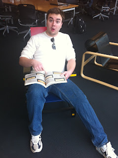 In hindsight, this wasn't the best view of the chair to prove we visited Knowlton. But, I promise, this was taken inside of the library there. And the chair in which I am sitting is the Red and Blue Chair by Gerrit Rietveld. Interesting fact about that guy? He got involved with architecture as well and designed the Rietveld Schroder House. Oh, and I guess I should mention a bit about the book/picture. Heh, I made that specific face because the design article I picked out was completely done in Spanish.
Clue Number 3)
 Here, we have the Wexner Center's lovely corridor of lights, with a very distant/tiny me treating it as a casual leaning post. For the interesting fact, this building was designed to smooth the different angle of the city's grid layout with OSU's. It actually does an excellent job of this.
Clue Number 4)


http://bridgetmears.blogspot.com/
http://dancsp11.blogspot.com/
Clue Number 1)

Clue Number 2)

Clue Number 3)

Clue Number 4)

Philip Johnson was the man who designed the math and science library. And this particular building was designed in a manner in which the arches show the front with one arch in particular being much larger and more defined than the others. This is done on purpose, as if to becon people to that specific entrance. In the picture it is denoted by the lack of windows directly above it and the off colored pattern when compared to the brick around it.
Clue Number 5)

And here, we have the Thompson Library, done by Acock and Associates. This photo was taken to capture Mr. William Thompson himself as well as the main library on campus. The architecture has quite a modern feel to it and the inside offers an astounding view over the oval and the surrounding areas.
Monday, April 18, 2011
"A02:" The Secret
Title was a song done by Emery. Neat song, kinda emoish group. 'Bout all I know about them. Liked this particular title because the designers I chose remind me of the expression 'get rich quick', to which all of them figured out the secret to do so. This blog will discuss three different people who impacted the field of design using different areas of expertise and respective design skill sets.
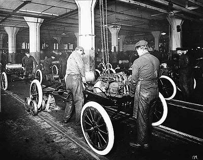
First, I want to tip my hat to a man who revolutionized the modern world of mass production. For my first designer, I chose Henry T. Ford. This man was born in the late 1800's and came to fame in the early 1900's. Thoughtout his life, he applied himself to various forms of work which included rural farm labor, work on steam engines (and on other factory based projects), and even in sawmills. He married, raised a family, and eventually became an engineer focused on applying a modified 'steam engine' design to a small, more personal, land vehicle. He created the Ford Motor Company who specialized in production of one of the orginal, 'modern', automobiles Now, how what was it that he actually designed? Henry Ford realized the production times/costs of these vehicles would be far too expensive for an average consumer. Thus, he is credited with designing and implemnting the traditional assembly line still used today. Ford made tasks simple, allowing unskilled labors a job, standardized parts, created a convayor belt system which brought the product to the workers instead of the other way around. In short, the assembly line was a modern work of genius from a fiscal stand point. It optimizes worker production effeciency as well as product output. I have mixed feelings myself, seeing as this design helps to greatly lower prices for consumers, making large complicated devices affordable. Because on the other hand, the assembly line creates often fast, physically demanding work enviornments which are boring and potentially dangerous. In essence, it allows companies to abuse and rotate workers quickly and efficently for profit. Regardless of personal feelings though, the assembly line design is vital to most prominant, large scale business today and thus, instrumental to the American economy.
Information about Ford - http://www.hfmgv.org/exhibits/hf/default.asp#childhood

http://manassashyundaielantra.wordpress.com/2011/03/01/following-henry-ford/
http://www.johndclare.net/America4.htm
Next, I wanted to jump ahead and look at something a little more modern in time and culture. For the second designer, I selected Mark Zuckerberg. This man is best known for the extremely popular social website known as Facebook. Zuckerberg is actually a relatively young person, being born in 1984. He was an extremely talented programmer and gifted student. For example, he created several different software programs. One which allowed a simplified messenger system from computer to computer. Another that was a data collection program coupled with music apps in order to better 'read' the user and fine tune music selections. And obviously, his most known piece, the social networking site known as Facebook. He has had job/money offers from giant corporations, such as microsoft, but ultimately chose his own route by managing his successful website. The man has connected millions and millions of people now, and has gained a large amount of wealth. Due to the wide use and success of his software, the man has become quite famous. Now, for my personal take on the situation? The man knew exactly what people wanted socially, and has done an excellent job on delivering. His design has all but made Myspace obsolete, and brought about the creation of other streamlined blogging sites, such as twitter. With personal interaction, I must say I don't fully understand the appeal to the website. The main purpose is to share blog based material, yet somehow, people will waste hours on the site. Most of the people who would see the information are close friends, which means they already know the information. What suprised me the most, though, is how advertising firms and even professional businesses adopted the use of the site as well. Essentially, I feel the website is incredibly frivolous and useless. Yet, it continues to appeal to the recreational lives of large numbers of people.
Information on Zuckerberg - http://en.wikipedia.org/wiki/Mark_Zuckerberg

http://www.allvoices.com/contributed-news/7628850-mike-zuckerberg-facebook-founder-personal-2010

http://www.facebook.com/
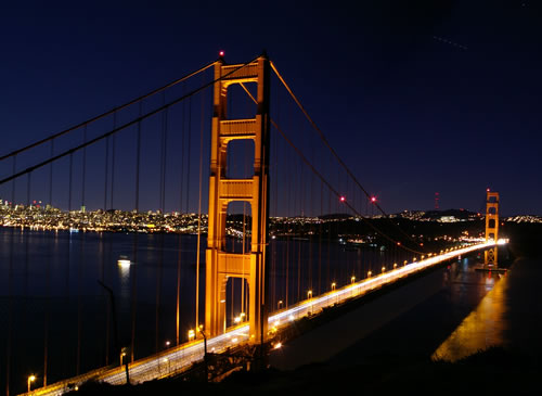
And finally, I picked Joseph Strauss for my final designer of the three. I started with a production concept designer, moved on to a software and visual concept designer, and finally ended the trio with a large scale architect. Strauss came from good ol' Ohio. Yes, that is right, he was supposedly born in Cincinnati here in Ohio. He was born roughly a decade after the Civil War into an artistic based family. This inspired him to attend college (at the University of Cincinnati). He focused on art based studies following in his familys footsteps. But he also had dreams and ideas for large scale transit in the form of railway systems and bridges. After college, he began a career in drafting which allowed him to experiment with different bridge designs and building techniques. Over the years, Strauss worked for various companies and not only designed, but oversaw the construction, of hundreds of bridges across the nation. However, wasn't until an engineer in San Francisco approached Strauss that the idea of a suspended bridge came to him. After a long process of debate and opposition against the building of said bridge, Strauss finally was given approval by the city to begin construction of the Golden Gate bridge. It was his first suspended bridge, and by far, one of the longest in the nation. He designed it, with help from some other engineers who worked out the technical aspects. Sadly, however, the bridge would be one of his last major accomplishments. Less than a year after completion of the Golden Gate, he would die of a stroke due to complications which began during the construction of the bridge. I feel that the bridge itself was a major benchmark in modern design/engineering. The San Fransico Golden Gate bridge might even be considered a modern world marvel and is certainly one of the easiest to identify by picture. Personally, I find the bridge to be gorgeous and I'm impressed it has been around for so long. For the designer himself, it's always cool to learn that someone famous came from Ohio. But it was speculated he might have suffered from mental issues and physical illness for the last decade or two of his life. So, in hindsight, perhaps artistic genius put too much pressure on Strauss?
Information on Strauss - http://www.pbs.org/wgbh/amex/goldengate/peopleevents/p_strauss.html
 '
'
http://www.historylink.org/index.cfm?DisplayPage=output.cfm&file_id=7283
http://essentialdegs.files.wordpress.com/2011/01/golden-gate-bridge-night.jpg
First, I want to tip my hat to a man who revolutionized the modern world of mass production. For my first designer, I chose Henry T. Ford. This man was born in the late 1800's and came to fame in the early 1900's. Thoughtout his life, he applied himself to various forms of work which included rural farm labor, work on steam engines (and on other factory based projects), and even in sawmills. He married, raised a family, and eventually became an engineer focused on applying a modified 'steam engine' design to a small, more personal, land vehicle. He created the Ford Motor Company who specialized in production of one of the orginal, 'modern', automobiles Now, how what was it that he actually designed? Henry Ford realized the production times/costs of these vehicles would be far too expensive for an average consumer. Thus, he is credited with designing and implemnting the traditional assembly line still used today. Ford made tasks simple, allowing unskilled labors a job, standardized parts, created a convayor belt system which brought the product to the workers instead of the other way around. In short, the assembly line was a modern work of genius from a fiscal stand point. It optimizes worker production effeciency as well as product output. I have mixed feelings myself, seeing as this design helps to greatly lower prices for consumers, making large complicated devices affordable. Because on the other hand, the assembly line creates often fast, physically demanding work enviornments which are boring and potentially dangerous. In essence, it allows companies to abuse and rotate workers quickly and efficently for profit. Regardless of personal feelings though, the assembly line design is vital to most prominant, large scale business today and thus, instrumental to the American economy.
Information about Ford - http://www.hfmgv.org/exhibits/hf/default.asp#childhood
http://manassashyundaielantra.wordpress.com/2011/03/01/following-henry-ford/
http://www.johndclare.net/America4.htm
Next, I wanted to jump ahead and look at something a little more modern in time and culture. For the second designer, I selected Mark Zuckerberg. This man is best known for the extremely popular social website known as Facebook. Zuckerberg is actually a relatively young person, being born in 1984. He was an extremely talented programmer and gifted student. For example, he created several different software programs. One which allowed a simplified messenger system from computer to computer. Another that was a data collection program coupled with music apps in order to better 'read' the user and fine tune music selections. And obviously, his most known piece, the social networking site known as Facebook. He has had job/money offers from giant corporations, such as microsoft, but ultimately chose his own route by managing his successful website. The man has connected millions and millions of people now, and has gained a large amount of wealth. Due to the wide use and success of his software, the man has become quite famous. Now, for my personal take on the situation? The man knew exactly what people wanted socially, and has done an excellent job on delivering. His design has all but made Myspace obsolete, and brought about the creation of other streamlined blogging sites, such as twitter. With personal interaction, I must say I don't fully understand the appeal to the website. The main purpose is to share blog based material, yet somehow, people will waste hours on the site. Most of the people who would see the information are close friends, which means they already know the information. What suprised me the most, though, is how advertising firms and even professional businesses adopted the use of the site as well. Essentially, I feel the website is incredibly frivolous and useless. Yet, it continues to appeal to the recreational lives of large numbers of people.
Information on Zuckerberg - http://en.wikipedia.org/wiki/Mark_Zuckerberg
http://www.allvoices.com/contributed-news/7628850-mike-zuckerberg-facebook-founder-personal-2010
http://www.facebook.com/
And finally, I picked Joseph Strauss for my final designer of the three. I started with a production concept designer, moved on to a software and visual concept designer, and finally ended the trio with a large scale architect. Strauss came from good ol' Ohio. Yes, that is right, he was supposedly born in Cincinnati here in Ohio. He was born roughly a decade after the Civil War into an artistic based family. This inspired him to attend college (at the University of Cincinnati). He focused on art based studies following in his familys footsteps. But he also had dreams and ideas for large scale transit in the form of railway systems and bridges. After college, he began a career in drafting which allowed him to experiment with different bridge designs and building techniques. Over the years, Strauss worked for various companies and not only designed, but oversaw the construction, of hundreds of bridges across the nation. However, wasn't until an engineer in San Francisco approached Strauss that the idea of a suspended bridge came to him. After a long process of debate and opposition against the building of said bridge, Strauss finally was given approval by the city to begin construction of the Golden Gate bridge. It was his first suspended bridge, and by far, one of the longest in the nation. He designed it, with help from some other engineers who worked out the technical aspects. Sadly, however, the bridge would be one of his last major accomplishments. Less than a year after completion of the Golden Gate, he would die of a stroke due to complications which began during the construction of the bridge. I feel that the bridge itself was a major benchmark in modern design/engineering. The San Fransico Golden Gate bridge might even be considered a modern world marvel and is certainly one of the easiest to identify by picture. Personally, I find the bridge to be gorgeous and I'm impressed it has been around for so long. For the designer himself, it's always cool to learn that someone famous came from Ohio. But it was speculated he might have suffered from mental issues and physical illness for the last decade or two of his life. So, in hindsight, perhaps artistic genius put too much pressure on Strauss?
Information on Strauss - http://www.pbs.org/wgbh/amex/goldengate/peopleevents/p_strauss.html
'http://www.historylink.org/index.cfm?DisplayPage=output.cfm&file_id=7283
http://essentialdegs.files.wordpress.com/2011/01/golden-gate-bridge-night.jpg
Saturday, April 16, 2011
"RR01:" Complicated
The title is a song done by Bon Jovi. To be honest, I'm not a real big fan of theirs. The group is pop metal, and that is an awkward sounding combination to me. However, they were quite popular for awhile, and they do have a couple of catchy songs. More important is the actual title. I chose it because it seems to describe 'design' perfectly. As this post will show, design is not easily explained (not accurately, anyways) because it is such a broad topic. So, what is design? It's complicated! And as always, I like to start with a brief overview of the post. I wasn't sure if we needed to site the actual textbook or not, so I did not on the grounds that it is an understood assigned reading from one single book/author. If this is a problem, I will change it for the next post, but all I plan to do is say what page I found my material on. Also, it should be noted that a true critical analysis over this many pages would easily be over 15 double spaced, typed pages, so to shorten this for a blog format, I intend to dedicate about a paragraph to every chapter. I'll pick something that really interested me, break it down, and discuss it a bit to save time/space. Because let's be honest, you guys don't want to read that much, and frankly, I don't want to type all of it out in a coherent, literate fashion. Now, on to chapter one.
With chapter one, I felt like the big idea he wanted to stress was design is misunderstood due to various human/cultural aspects. The field of design is, in fact, difficult to sum up, largely due to the fact that the word 'design' encompasses so much material. Thus, it means many different things to different people. In other words, design can not be simplified to a simple definition and approached the same way to be taught or applied. Heh, imagine a painter who excels with a brush trying to sit on a computer and use the architects software to design a functioning building.That is hardly the same skill/expertise. The point is, again, design meant two different things to the people applying the respective skills. Since design encompasses different fields, different definitions, and people (varying from the individual to an entire culture) perceive their environment differently, it is hard to simplify. So difficult, in fact, that it really can't. It can only focus on certain aspects at a time and the best we can do as a whole is to understand that each area is a little piece of design which fits neatly together to form a whole. The key idea? Design is a huge part of our lives and can be found everywhere and in everything. It just takes many, many different forms.
Moving on to chapter two, Haskett briefly highlights humans role in design, claiming that "There has been change and evolution...but human nature as remained remarkably unaltered...[thus] design [is] a unique and unchanging human capability" (Haskett, 8). He continues with the chapter giving various historical examples to support his claim, showing how design has simply been improved upon over time. While I agree that design is unique to humans (we are, after all, the only species who radically shapes our environment for simple aesthetic pleasures), I disagree that it has been unchanging. For instance, do all humans perceive design the same way? Of course not; that was discussed in the preceding chapter. So if that is the case, how can design not change? It has been forced to fit so many different fields and subjects after all. Furthermore, technology allows for innovations. It allows for new designs and ideas to be realized that would have otherwise been inconceivable or impossible. For example, I do not believe modern day luxury ideas, such as this very computer I'm typing on, were thought of in early human history. If you want to go back to 'the beginning', regardless of what you believe in, humans focused on basic instincts. Keeping safe, providing nourishment, reproducing, etc. They did not have the time or resources at their disposal to think of such things. Their inspiration came from basic shapes in which would become useful to help them live out their lives. So how can design remain 'unchanged' when at one point in time, such ideas were inconceivable, yet now, they are a fact of life?
Next came chapter three, and the key idea I focused on was form versus function. It should be noted that, both in the book, and within the lecture notes presented to us, a prevailing theory was 'form follows function'. Catchy, if nothing else, making use of consonance with the letter 'f'. But, of course, there is much more to the phrase than simple writing terms. It was readily believed that, when designing something, the function was key to the process. And once the function was established and successful, then form would be applied to aid in said function. In the natural world, this definitely appears true. And even in human history, I would say it also held true. But I think it is important to challenge this idea as well. Just because something functions well, does that mean we should not be as concerned with aesthetic value? Maybe a better way to approach this idea is by analyzing our own economy. We are based on industry/commercial enterprises. As a national community, we buy products that appeal to us in someway. Now, when selecting a product, let's say an automobile, and specifically, a typical car, do all of them not have identical functions? I would say, for a car, the point is to move a person(s), semi-comfortably and quickly, from point a to point b. Now, assuming that is the primary function of the car, why is it that there are so many different auto makers? I argue it is because of form. All cars have different shapes, colors, designs, extra features, etc, etc Their key function all remains the same, however, as consumers, we have developed personal interests and tastes based off of aesthetics. Thus, I believe that function is vital. However, I believe form is what attracts people. Form is what interests people to buy said product and have self satisfaction from the use of it. Without form being stressed, a product simply works, yet does nothing to change a persons mood.
Chapter four follows the above, and it discusses the significance objects play in the world of design. Where as above, the idea has been form follows function, now from a post-modern perspective, form has taken the emphasis, and it allows designers to create products in ways that appeal to them instead of their potential consumers. It seems readily apparent, then, problems shall occur in the opposite end of the spectrum. Instead of dull, unappealing products, you have lively, striking products which appeals to individuals tastes. The trade off then? Functionality of course. Many of these 'unique' products beg to ask the question 'what, exactly, does it do...?' And the answer isn't always apparent. In fact, several of the more radical, yet unique, designs end up being even less functional than their counterparts. To complicate this further, they tend to be more expensive too. An example given in the book discussed a lemon juicer (Haskett, page 38) and how it was sought after as a kitchen piece, yet worked so poorly. Ultimately, the person would have to buy another, cheaper juicer to use, and allow the 'kitchen piece' to sit unused, adorning the counter top or cabinet in which it rests. In essence, some of these object designs appear to have become the traditional thought of 'works of art', much like a painting hanging on the wall. It is interesting, it is thought provoking, but ultimately, it is useless in function. And unless a person is coming from the upper end of society, the lack of extra spending money rules these objects out as household items. This, then, makes the 'art' piece more desirable and classy. These objects are then associated with rich individuals and become a symbol for status.
Now comes chapter five, which discusses communication within design. It immediately draws a comparison between objects and visual based communicative designs. The two key differences are centered around ease of use and emotional/thought provoking reactions. First, objects are simplistic to use, where as communicative designs need words and or definitions to help explain their meaning. Second, objects rarely provoke emotional responses. It is understood or implied how the device works, and that is the purpose it serves. But with communication based designs, images are readily available and used. And these images evoke a multitude of emotional responses which serve some purpose (Haskett, 55). After all, a picture is worth a thousand words, no? The rest of the chapter focuses various uses and fields within communication design. I don't have a lot of critical thought here, but I would like to note that visual communication can be a very powerful tool. Again, referencing our own economy, advertising programs spend their whole lives trying to use images and ideas to convince consumers to spend money on their products. And what about news based organizations? Sure, they inform you of what is going on, but how often do they seem to use subtle words/phrases and graphic images to influence public opinions? Communicative design is, again, a powerful tool that can easily influence masses into certain thought patterns and/or feelings. It has even gone as far as making brand names household expressions, and many companies have been made (or destroyed) with striking logos. So while communications isn't necessarily tangible, it is just as important (if not more so) than other fields within design.
And finally, chapter six features the environmental setting which houses the various aspects of design. Specifically, it focuses on the outer and inner environment of homes/businesses in various countries, and how their trends seemed to have changed over the decades. It would seem that the environment is rather important on an individual level because it is what holds all of the other various design areas, including the objects and visual communications, in one location. It is the 'big picture' within which the other designs can be found. And furthermore, it seems that environments, at least for the individuals, are physical manifestations of idea happiness/comfort. It serves as an outlet to put quirks and identities on display so that anyone visiting can, at a glance, get an idea about what matters to that individual. This is all affected by factors such as money, time spent at a place, whom owns it/rents it, etc. On a more personal level, I can understand how this matters and can affect a persons overall mood. For instance, going to college at a young age, like I am now, means that I don't own the residence in which I am living. I'm just a temporary tenant. As such, it means I have to compromise price with quality/luxury. That said, it means I have to live in a place that does not satisfy my personal aesthetic desires. And since I am a renter and not an owner, I have littler authority to change it radically to fit my desires. Thus, a perfect harmony can't be achieved; I simply have to make due and put as many of my personal items of design based interest in the house as possible.
Thursday, April 14, 2011
"J03:" You're My Best Friend
I'd like to give a nod to Queen, as they are the artist of the posting today. While overly glamor obsessed, these diva men had some incredible songs. They produced one of the most memorable ballads of all time, and their wide vocal range is still envied by many a singer today. Time now to actually ponder the other blogs. I'd like to note first that, since there are a total of three posts thus far, one of which being a 'getting to know you' post, there isn't a large amount of content to critically analyze and comment upon. So to meet that end, most of the material will be focused upon the last journal involving the pictures of patterns. And specifically, I read through Bridget and Dans' blogs since they were the two members whom I got to know a little bit during the first day of class. On to the post then?
First, I'd like to begin with Bridgets' site. It was interesting to see that she had personal connections to the items/materials we covered in the first power point lecture. I appreciated that due to the difference in us; my family never had any of the specific items mentioned. In fact, I never knew about ANY of the chairs. So needless to say, I my family never owned any of them. Jumping ahead now to journal number 2 with the pictures, I really liked the theme she set up. Beyond the obvious school spirit idea, I appreciated it because I, too, enjoy focusing on themes in design. And congruent, symetrical patterns are even better, hence the block O she sought. Kuddos on the pictures; loved the pictures, themes, and overall school spirit! http://bridgetmears.blogspot.com/
Next, I looked at Dans'. Again, starting more with a personal note, I think it is really cool he has already made up his mind about switching to design. I remember talking to him the first day and he mentioned how he was on the fence about engineering (my major as well). So I am glad he found something he really like now and I wish him luck. I didn't have my major picked out for about a year and a half into college myself. It can be stressful to spend so much money and not realize what the purpose is. Looking more to his pictures, I really enjoyed the photos he took personally. The first picture, specifically, was really fascinating. To begin with, I was sort of surprised that such a rough, unfinished looking wall was inside one of the dorm buildings. It has a rough, unfinished look. http://dancsp11.blogspot.com/
Sunday, April 10, 2011
"CR01:" One Step Closer
Here it is, late on a Sunday night, and I realize next week begins weeks three of the spring quarter. Which means there has already been two weeks of material covered when it feels like only yesterday the class was getting started! Hence the title for today (as sung by Linkin Park) implies we are just that much closer to the end of our quarter. So, let's take a moment and look back at what has been covered. During the first class day, simple pleasentries were exchanged. That involved drawing a card and matching it to form a group, and I just want to take a minute to say that should be done more often. I realize a quarter flies by when only meeting a couple times a week, but it really helps put students at ease and, I think, makes the environment more comftorable to learn in, when forced into ice breaking situations. But, maybe I'm just biased because I enjoyed the two people I got to talk to! Also, I'm very interested in learning what significance the card will play later, since we were suppose to keep it. All funny stories and pondering of questions aside, though, the first day was a unique and enjoyable experience which offered a breif overview.
Day two, however, was a straight up lecture on the history of design focusing on key events such as the industrial revolution, architecture concepts applied from the Bauhaus, and the evolution of the chair from the early 1900's up until post modernisms influences appeared. I was interested in watching the evolution of design, at least in the manor which it was presented to us, because it helped emphasize the impact it has played on both a small and larger scale. Looking at some of the early inventions of items (such as the early toilets) illistrated the clear difference in ideas of design from person to person. To me, it started to stress the concept of functionality versus aesthetic value. Also, by discussing the Bauhaus, and then comparing them with a couple of buildings located on campus, it would seem that design in all respects, be it product based, architecture, graphic, etc works on reinventing designs in a slightly different way rather than making completly new ones.
Day three involved a brief disscussion to touch base on up comming assignmets and class progression thus far. This was followed by a tour of a couple of libraries around campus, which included the Wexner Center and Knowlton Hall. I don't have alot of deep insight conerning the tour, but I would like to note that I had actually not been inside of either and was impressed by both. I was very impressed to learn we were the only large scale college with a commic gallery. And perhaps even more impressed by the layout inside of Knowlton hall. I was taken back by how large the inside of that building felt. However, it was a very positive experience; I loved the feel overall, and I appreciated the opportunity to see/sit in the various chair covered in the prior lecture. I doubt I would have ever done so otherwise.
Day four, the most recent, was another lecture class. This one covered the three general programs offered by OSU and gave a little bit of insight into what each did and had to offer. This class was a boost in my confidence for my minor choice becaue I felt more than ever that a design field would mesh perfectly with an engineering degree. Based off of the product based designs, it seems like the most efficent and well working products would be thought of/built by someone who had extensive knowledge in both areas. With the expertiese of an engineer, a person could pick the optimal materials to create an effienct, working product. And with the help of their design background, could find a happy medium in the strength of the material in order to shape and mold the design into something marketable and sought after. Other note worthy considerations would be the general idea of some uniformity is needed within design. Based off of the part where we discussed various sign posts not being universal, I believe it probably applies to a slightly larger aspect of desgin than just that. It would be very important, I feel, for designers to understand their general customers and societies for which they work. It seems that some markets would be more suited to certain themes than others. And no matter how 'awesome' a design might be, it just won't work if it's being pitched to the wrong group. i.e. , Mr. manly isn't going to want a pink house with rainbows, unicorns, and magical fairies incorporated into it. Nor would a formal buisness, such as a banking firm, want a logo that appears to be done by a child.
"JO2:" Beautiful America
Beautiful America, by Five Iron Frenzy. A decent song, and interesting band. They try to combine modern rock instruments and rhythms with a big band feel by using trumpets and other instrumentation. Which helps transition into this posting: interesting, man made patterns. I deliberately focused on all synthetic patterns created through industry.
* To save a little bit of time and writing, all of my pictures are assorted items found in or around my house, which is is about two miles from campus. All of which were also taken today, Sunday of April the 10th.


5) This image portrays an electric razor. I primarily chose it for the honeycomb structured pattern. It had a glossy finish, which makes it reflect light pretty well (as seen in the picture) and that coupled with the repeating hexagonal pattern seemed to be mesmerizing if you stare at it long enough.


10) This picture is of a typical rug. I chose it because, like previous posts, the pattern within patterns. Really, the entire piece is a big pattern consisting of several smaller ones. From the very fibers, to the line placement, and finally the overall picture of the repeating flowers. to me, it represents the shutters on a house with what might be vines/flowers growing on them. A very soothing and welcoming picture.

* To save a little bit of time and writing, all of my pictures are assorted items found in or around my house, which is is about two miles from campus. All of which were also taken today, Sunday of April the 10th.
1) The following pattern comes from a (approximately) 23 inch, Sanyo box tv. I just happened to be walking by and I noticed the interweaving grid of straight lines. I enjoy the way it seems to fan out, each 'missing' row becoming longer and longer as the grid continues to replicate itself.

2) This example was just a good quality, mens basketball I own. What attracted me to this one was the concept of a pattern within a pattern. There is the obvious black lines which stands out immediately which have a fixed, almost mirror like, scheme. But the bounding of the ball is actually composed of microscopic, circle like structures. There has to be thousands of those spread over the entire ball.

3) Yep, this one is as simple as it appears to be. It is nothing my than the brick siding on my house. I chose this one because I don't think the significance of the design/functionality of an alternating brick layout should be underestimated. It was placed in that position to increase the strength/stability and aesthetically, it looks sharp.

4) Honestly, I'm not sure what to say about this one other than I just thought it looked really cool. Is an arm of a comfortable desk chair, and I liked everything about it from the cool scheme, to the texture of it, especially the curvature/angles used in the design, and even the multi-holed pattern on top. It suits my personal taste very well.

5) This image portrays an electric razor. I primarily chose it for the honeycomb structured pattern. It had a glossy finish, which makes it reflect light pretty well (as seen in the picture) and that coupled with the repeating hexagonal pattern seemed to be mesmerizing if you stare at it long enough.

6) This one might be my favorite of the pictures that I took. The image is a shadow of a thin metal frame support that helps support the awning over the front door. The sun helped elongate the pattern, which formed altered geometrical shapes. Plus, the interweaving pattern gives the impression of various objects or possibly animals. For instance, I see a kite!

7) This picture came out a little blurry, so it might be hard to see the pattern. Its a simple light fixture mounted to the ceiling and I was impressed by the lines within the glass seem to start straight around the edges and slowly twist to converge at the center of the fixture which creates a spiral pattern and semi-optical illusion

8) Another light fixture within the home. This one is pretty straight forward in the patterns (most of which are some form of a rectangle). However, the curved metal frame adds a nice contrast to the straight forward presentation, and I especially liked how the blue stained glass portion does not follow a fixed pattern. It adds a nice contrast with the color when compared to the geometric pattern.

9) This picture is pretty obvious, I think. It is the car wheel of my Honda Accord. I focused on it due to the circular feel to it. Obviously the tire is round, as well as the hub cap. But even the holes and the corresponding lug nuts are. Plus, I liked the ribbed/bowed out texture that lies on the arms.

10) This picture is of a typical rug. I chose it because, like previous posts, the pattern within patterns. Really, the entire piece is a big pattern consisting of several smaller ones. From the very fibers, to the line placement, and finally the overall picture of the repeating flowers. to me, it represents the shutters on a house with what might be vines/flowers growing on them. A very soothing and welcoming picture.

Subscribe to:
Comments (Atom)